 Kerning (means adjusting white spacing in a proportional font.)
Prior to the DTP, designers used to adjust white spacing one by one by handwork in the old days.
However, you will never reach the big concept if you are worried about small thing in the beginning. That’s right.
But, when I am standing in the platform at my subway station every morning, I can’t help being conscious about this particular sign’s kerning.
Today I became free of such frustration.
カーニング(文字と文字の間隔を美しく調節すること)。DTP以前は日本語でも一文字一文字手で詰めたものです。英語も同じです。しかし、最初から小さいコトを気にしては大きいコンセプトにはたどり着けません。ハイそのとおり。
でも毎朝ホームに立つとき気になってしょうがないこのサインのカーニング。
今日このモヤモヤから解放されました。
 The NY subway signs are quite bald and clear and I believe these signs will put into tourists’ minds as well as one of the NY impressions.
Whether the subway with the accurate signs come into the station or not, I think it’s a great design system.
One thing, I hope this can be tad more sophisticated since it’s in public.
NYのサブエイのサインはとてもボールドで見やすく、おそらく世界中からの訪問者にもニューヨークの印象として記憶に残すはずです。サインのとおりの電車がそのホームに必ず来るかはともかく、とてもいいデザインシステムだと思います。公共のモノなのでもう少し洗練されててもいいかも。

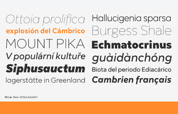
 Mirai, a new geometric sans font family, is clean, strong and composed yet effortlessly contemporary.
 Sophisticated. Cute. Modern. Morebi Rounded is a rounded font family with a simple geometric structure. It’s clean yet friendly style lends itself well to brand building.

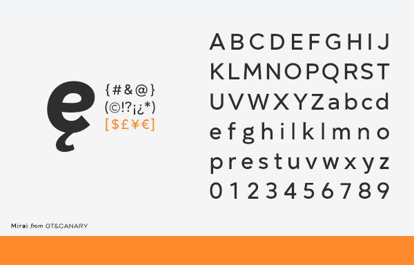
 I’ve been working on creating new fonts for many months and it will complete soon as I am adjusting kern and details of the lines at this moment. It will be 5 different weight, light to black with their matching italic. They are really nice fonts.

 Adding a little more organic feelings and still mischievous. I like them!